

Key takeaways
A clear and organized ecommerce homepage helps customers know where to go and makes them more likely to shop, leading to better trust and higher sales. Using simple layouts, focused content, and ongoing testing creates a smooth shopping experience that keeps visitors coming back.
Key points:
- Use plenty of whitespace to make your homepage easier to read and less crowded.
- Keep text short and clear, using bullet points or collapsible sections for extra details.
- Build a strong visual hierarchy with clear headlines, bold calls-to-action, and a consistent color palette.
- Choose high-quality images and icons that represent your brand, and organize content with grids for balanced layouts.
- Make navigation simple and always test your homepage to find and fix confusing parts.
| Tip/Principle | Key Insight | Why It Matters | Action Item |
|---|---|---|---|
| Strategic Use of Whitespace | Give content room to breathe with margins and padding | Prevents clutter and makes information easy to scan | Check margins and add space between sections |
| Short, Focused Content | Keep homepage text minimal and clear | Reduces overwhelm and helps users focus | Use bullet points and collapsible sections |
| Strong Visual Hierarchy | Use larger headlines, clear fonts, and bold CTAs | Guides users to the most important information first | Set main headlines to 32–40px, subheads to 24–30px |
| Consistent Color and Images | Simple palettes and quality visuals reflect your brand | Builds trust and keeps the page inviting | Limit to 2–3 main colors and compress images |
| Grid Layout | Organize sections and products with predictable grids | Makes scanning and groupings easier for visitors | Group similar content and align elements |
| Simple, Clear Navigation | Keep menus short and group links logically | Helps users find what they need quickly | Use 5–7 top-level items and clear menu labels |
| Regular Testing | Test with users and get feedback to improve clarity | Catches problems early and improves user experience | Run 5-second tests and ask for visitor feedback |
10 Actionable Tips to Achieve Visual Clarity on Your Ecommerce Homepage
Homepages are the digital front door to every ecommerce business. They are your first — and often only — shot to connect with customers, guide them, and drive sales. If your homepage is cluttered, confusing, or hard to read, users will leave. Fast. The good news is you can build visual clarity into your homepage with some straightforward steps. Today’s guide offers ten practical tips for anyone who wants to know how to design your website for better results.
Why Visual Clarity Matters for Ecommerce Success
Visual clarity means your website layout is easy to understand, pleasant to look at, and logically ordered. Why does it matter so much? Because clear design directly boosts trust, keeps bounce rates low, and delivers a better shopping experience. According to a Clueify study, designs with strong visual clarity increase readability, improve conversions, and lead to happier customers. When your homepage feels simple and focused, visitors know exactly what to do next — and they stick around.
Proven Approach to Homepage Design
At eDIGINO, we start every homepage project with one question: “If I landed here as a new customer, would I understand what to do in three seconds?” We want visitors to focus on your top products, not to wonder where to click. We balance visuals and text, remove clutter, keep navigation intuitive, and test every element for impact. Our method gets results that clients can measure: higher clarity, more clicks, and better sales.
Tip 1: Use Whitespace Strategically
Best ecommerce websites understand whitespace is not “empty space” — it’s breathing room for your content. There are two types:
- Macro whitespace: The larger spaces between sections, hero banners, and main content blocks. Macro whitespace guides the eye and groups information.
- Micro whitespace: Small spacing between elements like lines of text, buttons, or between a product image and its price.
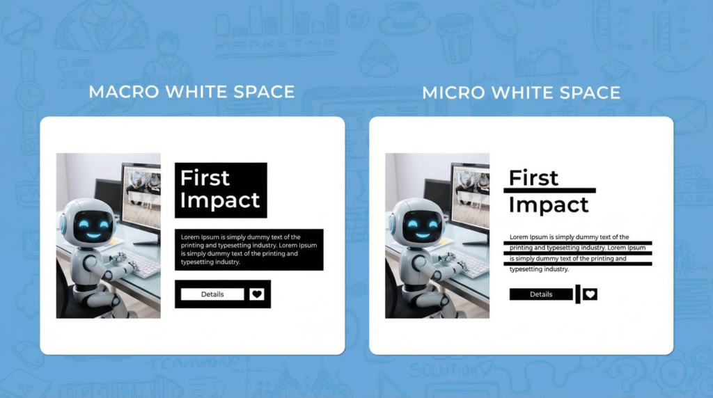
For better visual clarity, add generous margins around major sections and enough inner padding so each element stands on its own. Too much crammed content can hurt conversions and trust. We always check margins and paddings before publishing a homepage.
Tip 2: Limit Text and Try Collapsible Sections
Most new ecommerce owners make the same mistake: they try to fit every detail on the homepage. Don’t. Homepages should have enough to interest a visitor, but not so much they feel overwhelmed.
- Keep main landing page text below 150 words when possible.
- Use short, clear bullet points for features or key facts.
- Add collapsible content for longer info — like “Shipping Info” or “Sizing Guide.” Visitors can expand it if they want, but it doesn’t clutter the page.
This approach is how to design your website to make learning (and shopping) easy.
Tip 3: Build Strong Visual Hierarchy
Visual hierarchy is the art of guiding a user’s attention from most to least important content.
Effective homepage layout includes:
- Main headlines (H1) sized between 32 and 40px.
- Subheadings (H2) at 24 to 30px.
- Contrast and bold for calls-to-action, like “Shop Now” buttons.
- Color and font weight differences for key areas.
Following these headline size best practices ensures your main message is crystal clear — visitors know where to look first.
![]()
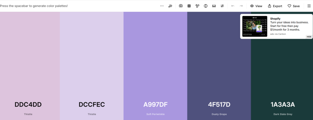
Tip 4: Optimize Your Color Palette
Using a simple color palette is essential. Two or three main colors, plus 1-2 accents, work best. Too many colors can feel distracting, while too few create a bland look. Stick to your brand’s main hues and check contrast. Text should stand out clearly against its background — aim for contrast ratios above 4.5:1 for small text, and 3:1 for larger fonts (WCAG guidelines).
Consistency with color builds trust and adds to strong visual clarity. If you don’t know what colors fit with your brand you can use website color pallets like Coolors to suggest colors that naturally blends with your brand.
Tip 5: Select High-Quality, Brand-Aligned Images
Optimizing images means finding the balance between beautiful visuals and fast performance. Images should be clear, relevant, and reflect your brand. Compress photos before uploading them to keep loading times under three seconds — the maximum most users will wait before bouncing (source). Whenever possible, use uniform backgrounds and avoid busy graphics behind text.
Every image should earn its spot. No fillers.
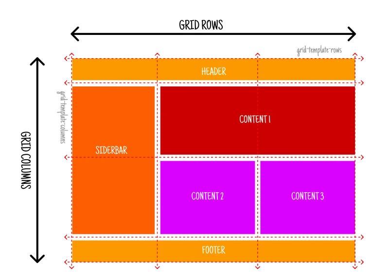
Tip 6: Structure Content with Grids
A grid system brings order and visual clarity. Grids align headings, banners, and product blocks, so your homepage feels balanced. When layouts are unpredictable, customers get confused. Group related content — for example, all “New Arrivals” in one row — and leave enough space between these groups.
A reliable homepage layout helps users scan quickly. We stick to this principle for every ecommerce project.
Tip 7: Choose Icons That Guide Users
Icons are like road signs for your website. Pick icons that match your brand style and are easily recognizable (like a shopping cart or heart for wishlist). Don’t overuse them — too many icons can clutter your page. When used wisely, they replace some text and speed up navigation. It’s an easy website navigation trick that keeps your homepage clean.
![]()
Tip 8: Consistency Is Key for Branding
Consistent branding means using the same fonts, colors, and button styles everywhere. Shifting typography or colors from one page to another lowers trust. Whether a user lands on your homepage or a product page, every element should feel connected.
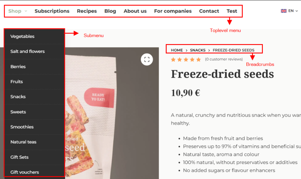
Tip 9: Make Navigation Effortless
Simple navigation is a cornerstone of how to design your website for results. Menus should be short, clearly labeled, and ordered by user importance. Swap generic links for clear labels — for example, “Track My Order” instead of “Services.” Limit top-level menu items to 5-7 for quick scanning, and use logical groupings for dropdowns. Breadcrumbs and visible search bars are a bonus for larger ecommerce sites.
Tip 10: Test and Refine Your Homepage
The final step for visual clarity is constant refinement. Try these methods:
- 5-second test: Show someone your homepage for just five seconds, then ask what stood out. This reveals your main message.
- Accessibility checks: Test with screen readers and high-contrast settings so everyone can use your site.
- User feedback: Add a simple survey (“Did you find what you were looking for?”) and adjust based on answers.
- Use AI for tips: AI tools could be a great help to highlight the strengths and weaknesses of your website. There are many ways to approach AI for these tips. One of our current approaches is using this Gemini Gem to review Landing pages.
We encourage A/B testing with real customers. The goal: upgrade clarity and experience with each tweak.
FAQs
What are the 5 golden rules of web design?
The five golden rules are clarity of purpose, simplicity, user-centric design, speed and responsiveness, and consistency with visual hierarchy. These rules keep your site practical, easy, and effective.
What is the 3-second rule in website design?
You have around three seconds to capture a visitor’s attention. Show your value, keep navigation clear, and make the main action obvious. Speed, clarity, and a simple message matter most.
How to make your website visually appealing?
Balance your layout, use grids, stick to 2-3 main colors, use matching graphics, improve typography, and add whitespace around key elements.
What makes a website high quality?
A high-quality website unites your brand, clean design, and helpful content to guide visitors toward action — all while remaining visually appealing and simple to use.
What are the 7 basic principles of web design?
They include unity, balance, hierarchy, contrast, emphasis, scale, and repetition. Together, these principles structure your site for ease and impact.
Get Professional Results with eDIGINO
Clear and focused homepages don’t just happen. At eDIGINO, we help ecommerce owners — from beginners to seasoned entrepreneurs — design websites that are visually clear, simple to use, and focused on outcomes. We use these ten tips every day to help clients grow trust, cut bounce rates, and drive more sales. If you want help applying these strategies or need a second opinion on your current homepage, our experts are ready.
Building visual clarity is how to design your website for today’s fast, mobile-first shoppers. Start with these tips — and remember, every great homepage begins with one clear message.
